

The JavaScript charting world has plenty of options. Still, many teams building real production dashboards end up picking the wrong tool. The problem usually isn’t lack of skill — it’s the way choices get presented.
Most roundup articles dump fifteen or more libraries on you and treat them as roughly the same. In practice, they’re not. Performance with large datasets, customization depth, and actual scalability vary a lot between them.
A library that feels fast with a hundred data points can drag badly once you hit thousands in production. Others promise lots of chart types but lock you into templates the moment you need something different.
That’s why we focused on ten libraries that actually stand out. Each one brings clear strengths in performance, flexibility, framework support, or overall developer experience.
Best JavaScript Chart Libraries
Choosing the right charting library can make or break your dashboard’s performance, especially when dealing with real-time data or complex visualizations.
SciChart
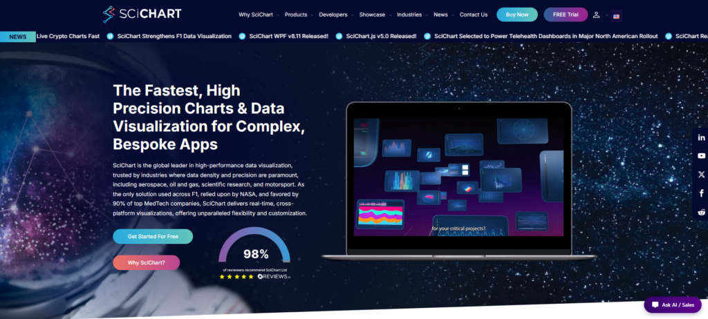
SciChart is easily one of the best JavaScript chart libraries available today. Founded in 2012, the team zeroed in on a real problem that most other tools still struggle with: showing massive datasets in real time without any noticeable lag.
The magic happens through its GPU-accelerated engine, which uses WebGL and WebAssembly. This combination lets it render hundreds of millions of data points straight in the browser, and it does so smoothly.
That’s why you’ll find it in tough environments like aerospace, scientific research, engineering, finance, and industrial monitoring. These fields demand quick updates, very low latency, and dependable visuals even when the data keeps pouring in.
What’s more, SciChart doesn’t stop at raw performance. It gives you plenty of customization choices and supports a wide range of chart types, so it works really well for specialized dashboards and other data-heavy projects.
Key features:
- High-performance WebGL and WebAssembly rendering
- Supports 2D and 3D charts, heatmaps, gauges, polar charts, and geo-maps
- Real-time streaming data and advanced synchronization capabilities
- Extensive API with deep customization and extensibility options
- Multi-platform support for JavaScript, WPF, iOS, and Android
- Comprehensive documentation with 170+ examples and demos
- Built-in AI documentation assistant
- Strong customer reputation, including hundreds of 5-star user reviews
- Enterprise licensing and dedicated technical support
D3 by Observable
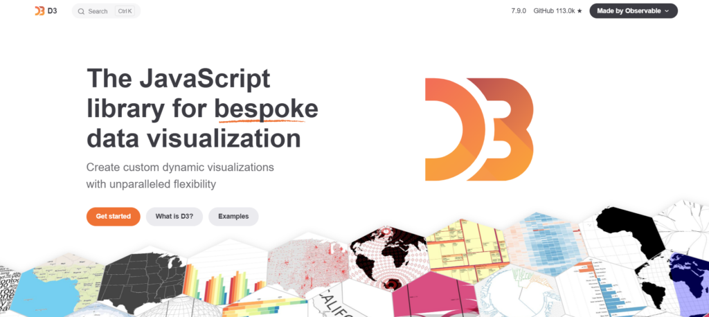
Since 2011, D3 has earned its reputation as the go-to library for developers who need full control over data visualizations. Unlike higher-level tools that limit you to pre-built options, D3 works at a lower level. It connects data directly to web elements, giving you the building blocks to create everything from force-directed graphs and hierarchical views to custom geographic projections.
The flexibility is excellent, though it does come with a learning curve. Once you get comfortable, you can design interactive experiences that respond naturally to users. Newsrooms, research groups, and dashboard builders often choose D3 precisely because it lets them create visualizations that don’t follow the usual patterns.
It does require more coding effort compared to simpler alternatives. But for teams that want to go beyond standard charts, D3 offers unmatched creative freedom.
Key features:
- Fully customizable—build virtually any visualization type
- Direct manipulation of SVG, Canvas, and HTML elements
- Declarative data-driven transformations with enter/update/exit patterns
- Modular design: use only the components you need
- Battle-tested by The New York Times, Bloomberg, and Observable
Recharts
Recharts launched in 2015 and was built specifically for React from the start. No adapters or extra setup required. Its component-based approach fits right into normal React workflows, so you can build charts the same way you build the rest of your UI — just drop in LineChart, BarChart, or AreaChart components and control them with props.
Under the hood, it uses SVG along with some lightweight D3 pieces for calculations and scales, avoiding the full D3 library. This keeps things lean while still giving you responsive, easy-to-compose charts. Animations and interactions work out of the box, and the whole API feels natural if you’re already comfortable with props and state.
It works especially well for teams working in React who want solid, production-ready charts without having to learn a whole new system or fight with complicated integration layers.
Key features:
- Declarative React components for 10+ chart types
- Responsive containers adapt to parent dimensions automatically
- Built-in animation and tooltip systems require zero config
- Lightweight D3 submodules keep bundle size manageable
- Active community with 20k+ GitHub stars and frequent updates
ApexCharts.js
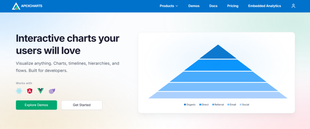
ApexCharts.js, founded in 2018, focuses on making interactive dashboards easier to build. With 20+ chart types and built-in tools for zooming, panning, and annotations, it saves developers from writing a lot of extra code for common interactions.
The library supports React, Angular, Vue, and Blazor with wrappers that feel right for each one. Its straightforward API and solid documentation help keep onboarding fast, which is important when deadlines are tight.
Teams building customer-facing dashboards particularly like it. Responsive design and touch support work well, and SVG rendering ensures clean visuals without bloating file sizes.
Key features:
- 20+ chart types, including financial candlesticks and heatmaps
- Touch-optimized interactions for mobile and tablet dashboards
- Framework wrappers for React, Vue, Angular, and Blazor ecosystems
- Annotation layers for highlighting trends without custom code
- Responsive by default with automatic legend repositioning
ZingChart
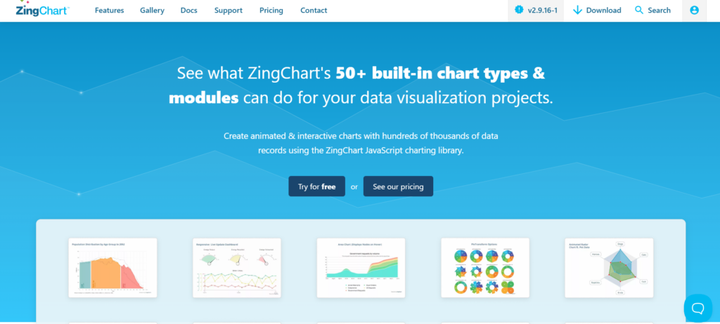
Since 2009, ZingChart has focused on one thing: fast, dependency-free JavaScript charts that actually perform with big data. It includes more than 50 chart types and stays responsive even when you’re dealing with tens of thousands of records.
Most other tools start to choke at scale. ZingChart doesn’t. It’s especially popular for financial dashboards, IoT panels, and analytics platforms that need to display heavy data loads. You get real-time updates and drill-down features built in, which saves a lot of extra work.
Plus, with no dependencies, it integrates cleanly into almost any codebase without version headaches. When data density and quick response times are critical, this library really shines.
Key features:
- 50+ chart types, including heat maps, radar, gauge, and stock charts
- Handles 10k–100k record datasets with optimized rendering engine
- Real-time streaming data support with automatic chart updates
- Zero dependencies simplifies integration and reduces bundle size
- Interactive drill-down and cross-filtering for complex dashboards
Fusioncharts
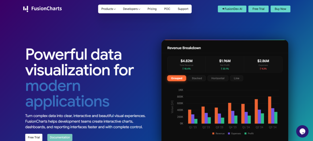
FusionCharts brings a lot to the table with 95+ chart types and over 1,400 maps. It’s especially useful when you want lots of ready options without heavy configuration.
Integration feels natural with React, Angular, and Vue. No awkward adapters or build complications. On top of that, the 20+ pre-built dashboards for sales, regional views, and financial reporting help teams launch faster.
What sets it apart is the simple, plug-and-play design. It avoids the usual tradeoff between framework support and chart variety. As a result, developers stay focused on building features instead of fixing integration problems.
Key features:
- 95+ chart types plus 1400+ maps for global data visualization
- 20+ dashboard templates covering analytics, finance, and operations
- Native wrappers for React, Angular, and Vue with consistent APIs
- Cross-browser compatibility without polyfill dependencies
- Enterprise-grade theming and white-label customization options
amCharts
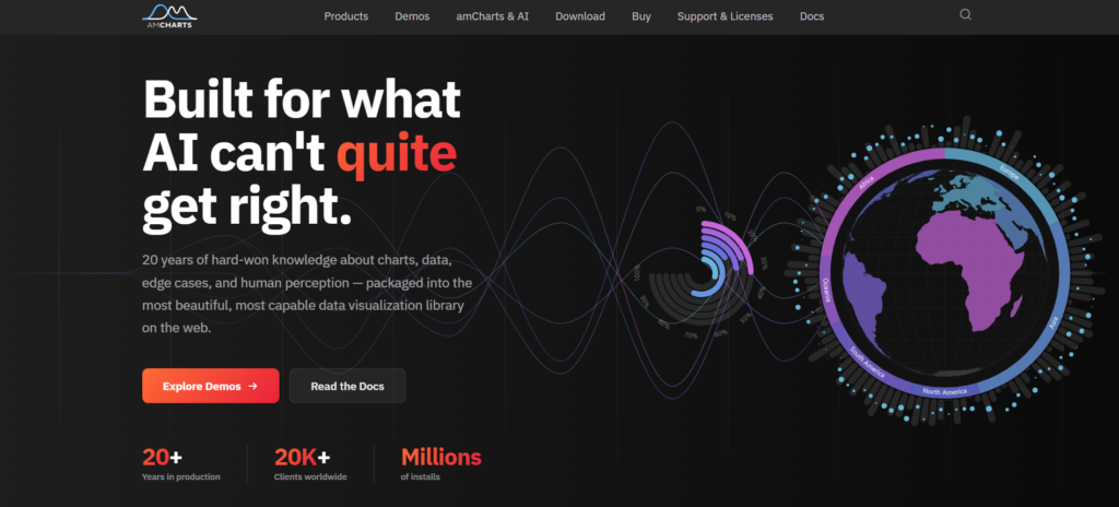
Since 2006, amCharts has built up solid expertise in creating reliable charting solutions for demanding dashboards. With over 60 chart types — from maps and financial charts to Gantt timelines — it works well for equity trading platforms and logistics systems alike.
The library shines thanks to its Canvas-powered engine, which manages large datasets much better than traditional SVG approaches. It avoids the performance issues that often come with heavy DOM usage. Accessibility comes standard, too, not as an add-on, making it suitable for regulated sectors. In fact, more than 20,000 companies trust it for important visualizations.
Its modular setup is another plus. You only include what you need, so your bundle stays light, but you can easily expand later as requirements change.
Key features:
- 60+ chart types: line, bar, pie, radar, heatmap, treemap, Sankey, chord, financial candlestick, Gantt
- Canvas rendering reduces DOM overhead for smoother animations and faster initial paint
- WCAG-compliant accessibility: keyboard navigation, screen reader support, high-contrast modes built in
- Modular loading: import only the chart types you use to minimize bundle size
- Geographic maps with drill-down, financial charting with technical indicators, and timeline visualizations
Highcharts
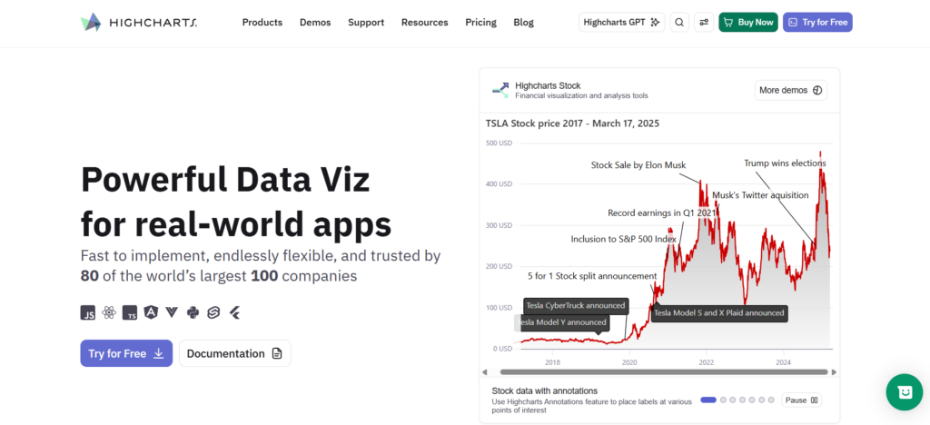
Highcharts is built by a mission-driven team delivering the highest-quality charting tools for developers who need both depth and breadth. The modular suite spans Core, Stock, Maps, Gantt, Grid, and Dashboards—letting teams start with basic visualizations and expand into financial time-series, geospatial analytics, or project timelines without switching libraries. This architectural flexibility is rare among JavaScript charting solutions.
Modern framework integration with React and others keeps adoption friction low, while strong accessibility and support for web and mobile ensure compliance-ready output across devices. The library handles complex, multi-chart dashboards with consistent APIs and styling. It scales.
Teams building production dashboards that will evolve—adding new chart types, integrating with corporate design systems, or supporting assistive technologies—find Highcharts’ comprehensive toolkit eliminates the need for library-switching mid-project, which is where most visualization strategies fail.
Key features:
- Modular architecture—buy only the components you need
- Built-in WCAG accessibility compliance across all chart types
- Unified API across Core, Stock, Maps, Gantt modules
- Enterprise-grade documentation and long-term support
- Responsive design with automatic mobile optimization
CanvasJS
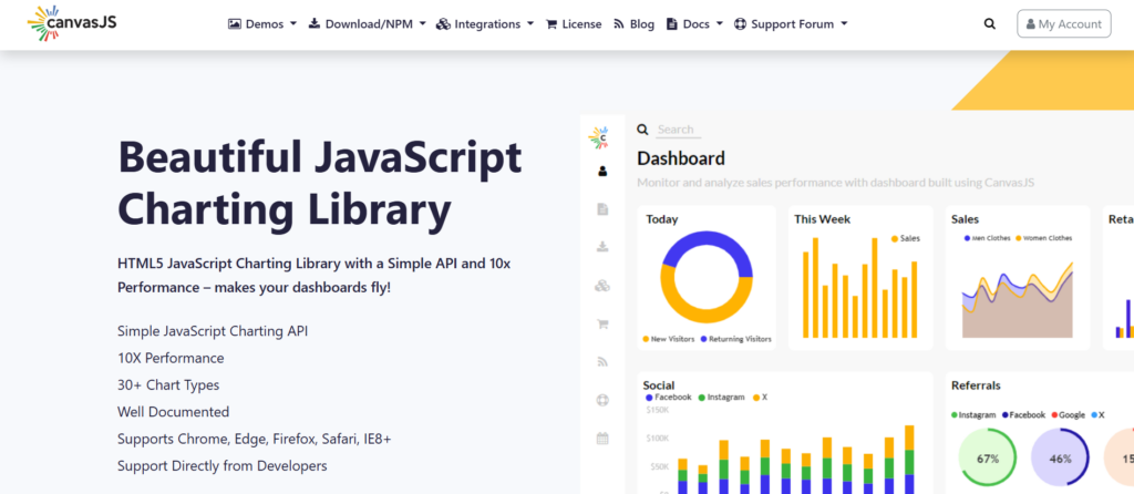
Since 2013, CanvasJS has focused on being a fast, lightweight charting library powered purely by HTML5 Canvas. SVG libraries get most of the attention, but this one proves Canvas can handle larger datasets with better animation and faster updates.
You get more than 30 chart types right out of the box — everything from basic lines and columns to doughnuts, pyramids, and specialized financial charts. The built-in StockChart feature with range selectors is particularly useful for real-time dashboards.
What many teams appreciate is how simple it is to integrate. It works well across devices without extra wrappers and fits nicely into plain JavaScript or legacy systems that don’t use React or Vue.
Key features:
- HTML5 Canvas rendering optimized for smooth animations at scale
- StockChart module with range selector and navigator for time-series
- 30+ responsive chart types with zero framework dependencies
- Simple JSON-based configuration for rapid prototyping
- Cross-browser compatibility back to IE8 for legacy environments
Plotly
Since its early days, Plotly has offered reliable open-source graphing libraries across JavaScript, Python, and R. The Dash framework stands out by turning charts into complete data apps that manage everything from live sensor streams to financial overviews without extra backend work.
You can use the open-source version freely in commercial projects. Plotly Studio adds a nice twist with AI-powered natural language queries that create charts on demand. For enterprise setups, options like Plotly Cloud and Dash Enterprise bring SSO, role controls, and horizontal scaling.
It serves as a good middle ground between fast prototypes and production-ready solutions. Many teams use it for internal BI or customer analytics, where both ease and scalability count.
Key features:
- 40+ chart types, including 3D surface plots and scientific visualizations
- Dash apps deploy as standalone Python/R web applications
- WebGL rendering for datasets exceeding 100,000 points
- Native integration with Pandas, NumPy, and data science workflows
Conclusion
Many JavaScript chart library roundups end up feeling overwhelming because the options all blend together. This one keeps things practical.
We highlighted 10 libraries that actually differ in meaningful ways: real-time handling of big data, customization flexibility, and how well they play with different frameworks. These factors become important once you move beyond prototypes into live dashboards. You’ll find strengths in GPU-accelerated performance, low-level control for unique visuals, easy component-based setups, or complete enterprise solutions.
Take a moment to consider your tech stack and data volume. Then test the top contenders with your toughest dataset. That practical check usually reveals the best fit for your project.